
← Back to feed
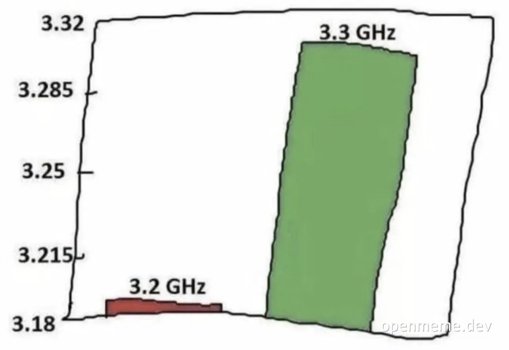



3.2 GHz vs 3.3 GHz: The Misleading Chart
A funny chart comparing 3.2 GHz and 3.3 GHz frequencies, using a misleading scale to make a tiny difference look huge.
Related memes
More memes with matching tags.
Loading comments...